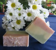
 I thought it was time for a change for one of my soaps, I think it was looking a little bit tired and boring, so Nature's Garden has had a face lift. The one above is the old Nature's Garden
The one below is the new look Nature's Garden. Now I'm not too sure if I'm still really happy with it, it might have to have another bit of a change next batch I make:) A work in progress! What do you think?

.jpg)
.jpg)
.jpg)


I think it looks delicious !!!
ReplyDeleteWell done...
It looks great Jan and I am sure that it will be just as beautiful to use too!
ReplyDeleteVery nice!! :D
ReplyDeleteI love it - the layer definitely adds to the interest of the soap upon first glance. Nice improvement =)
ReplyDelete